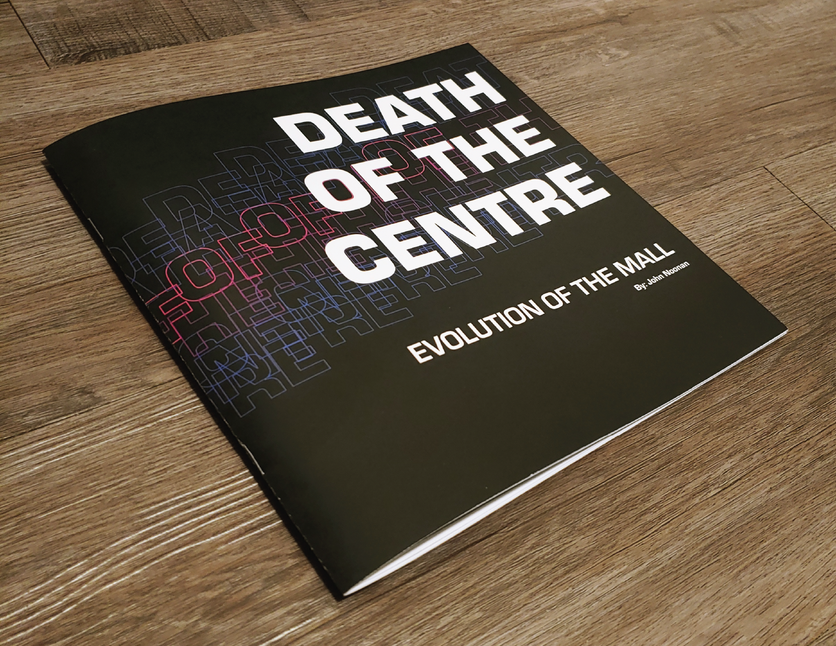
Death of the Centre for ISTD
2024 ISTD Assessment
OVERVIEW
I was a participant in the 2024 International Society of Typographic Designers (ISTD) Assessment. ISTD is a highly recognized professional community of typographers and designers, based in the UK.
Clicking on the book icon will lead you to an interactive PDF flip-book of the developed project brief: Death of the Centre.
ISTD
Book
Continue scrolling to see the Process of the project.
Death of the Centre
Historian and urbanist Dr. Alistair Kefford suggests that ‘the current crisis of the town centre reflects the collapse of a shopping-centred model of urban form, function and financing which has held sway in Britain since the 1940s.’ The trend is evident internationally where post Covid 19, town and city centres across the world are becoming desolate and empty spaces.
Of town and city centres, Kefford states that they have ‘long been oversupplied with shops, a legacy of the planning regime established in the post-war decades which encouraged local authorities to compete to attract investment and consumer spending.’ In an age where the legacy of the department store no longer has the presence that it historically had, and consumers continue to shop and spend money online, the town and city centre spaces are at risk of becoming unoccupied by businesses and consumers alike.
Brief
Create an experiential typographic intervention that asks audiences to re-engage in their local town or city. Consider how typography could reposition our understanding of place and space – inviting local dwellers and tourists to connect or reconnect with these spaces. You could use typography to celebrate local histories, explore narratives that led to the death of the centre, or consider how typographic practice could aid, inspire, rejuvenate or celebrate place and reconnect audiences with town and city centres.
There is opportunity to experiment with wayfinding, information design, augmented reality, branding, supergraphics and beyond.
Concept Origination
The idea of people engaging in their local town centers has been declining in recent years. What was once a thriving experience and form of entertainment, is now diminishing due to an ever changing world. There are many factors for this, such as increased internet usage. Due to this, people are frequently engaging less in their communities, as they have more options for entertainment at home. The increased use of online shopping is also a major factor in the decline of the in-person shopping experience.
During my upbringing, and even now, going to a mall has been an enjoyable leisurely pastime. The concept of the project is about showcasing that reconnecting with local town centers is still an encticing and worthwhile option.
This will be demonstrated through the context of American malls in general, by showcasing specifically a local mall in Illinois called Yorktown Mall. Yorktown Mall has been finding ways to adapt and evolve with the ever-changing times. Through written explanation about Yorktown’s adaptation, and an intriguing variety of image through type, the goal is to prove to the reader that malls are still an enticing and worthwhile option of entertainment.
Layout/Grid System
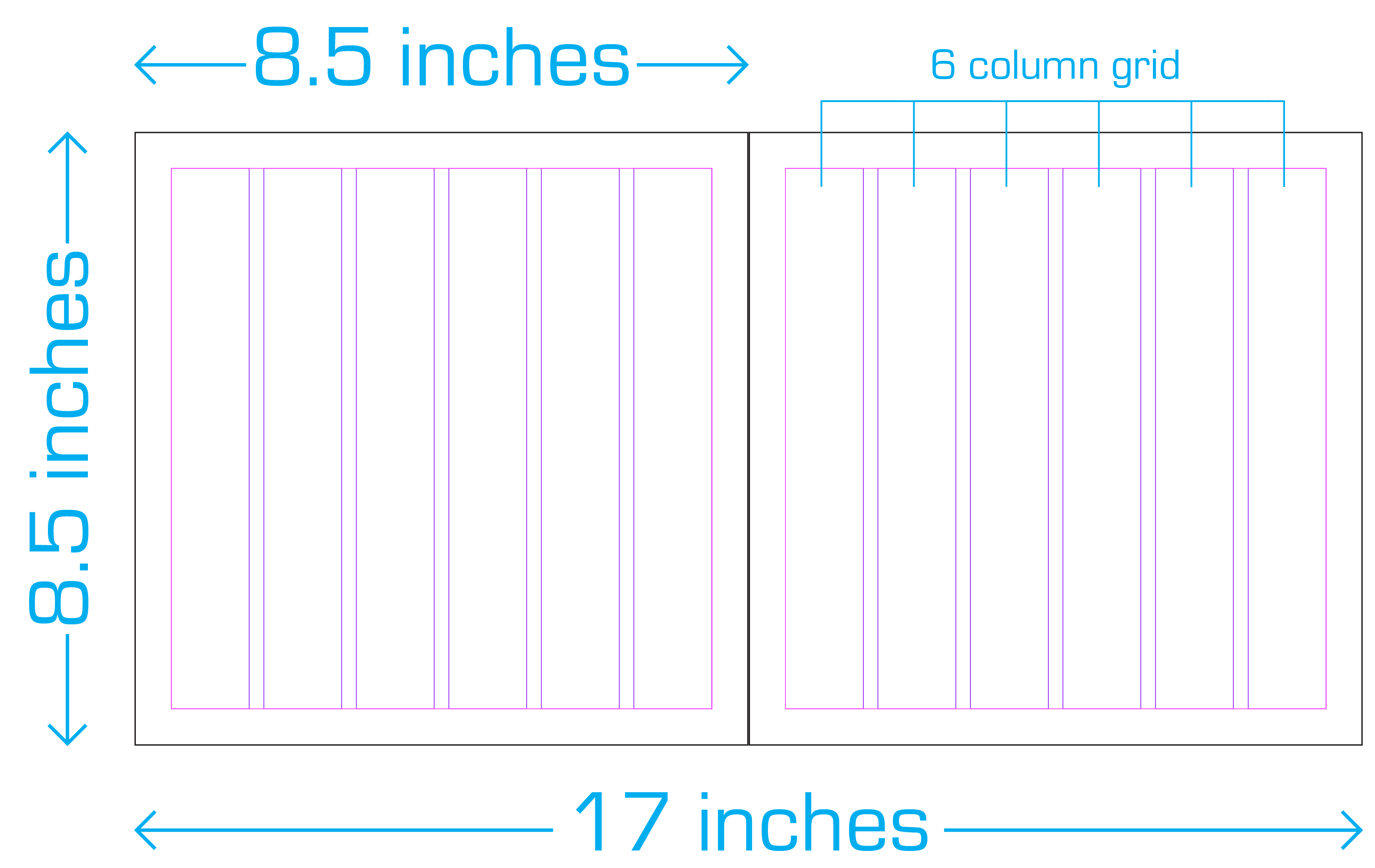
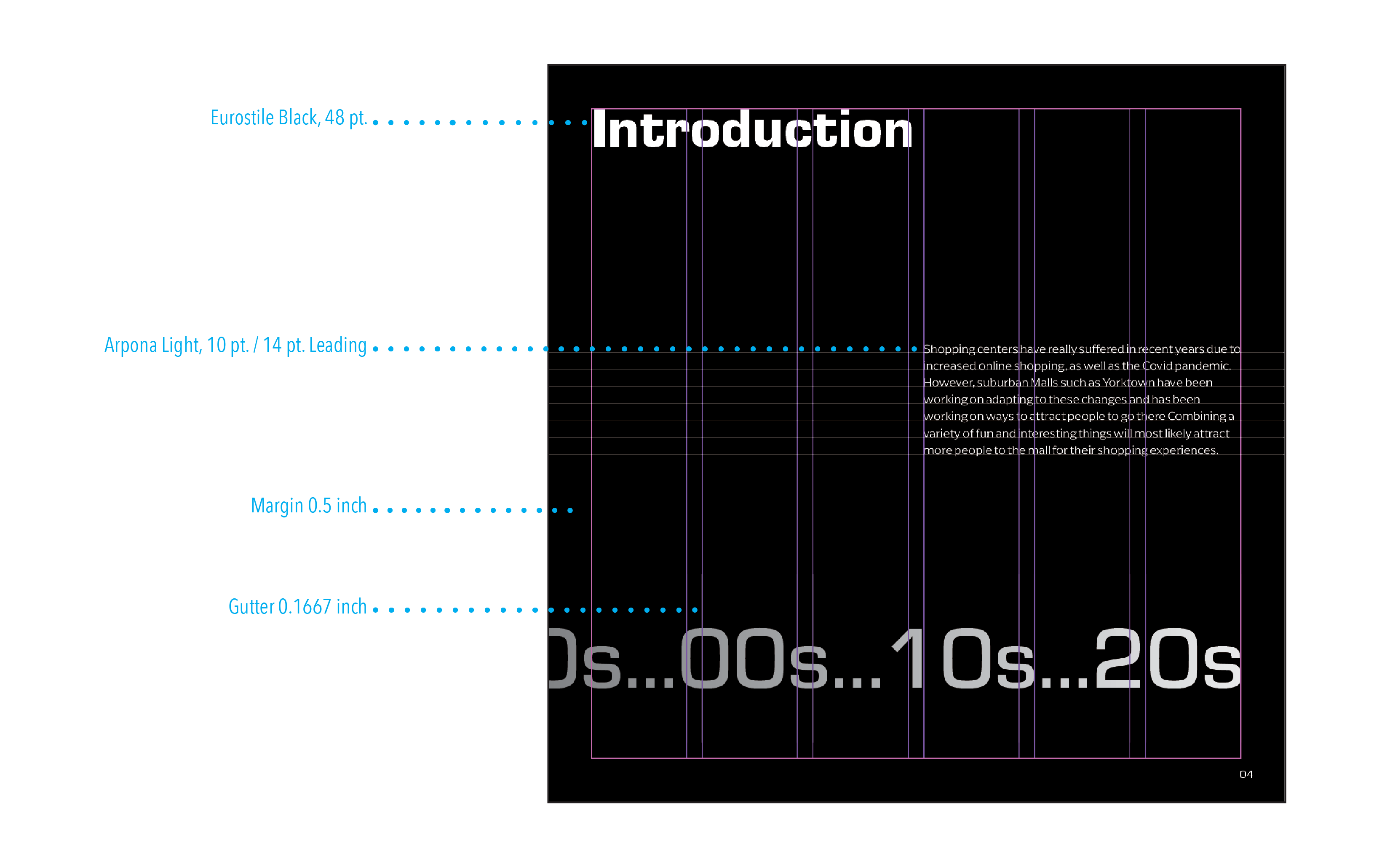
The layout of 8.5 inches × 8.5 inches for each side of the spread was chosen for it’s balanced and visually pleasing format. It allows for an engaging reading experience for a visually-oriented storybook.
The grid layout was chosen given it’s flexibility with typography and graphics.
It allows for easier division into mulitples
of 2 or 3 columns.
Typographic Decisions


Form
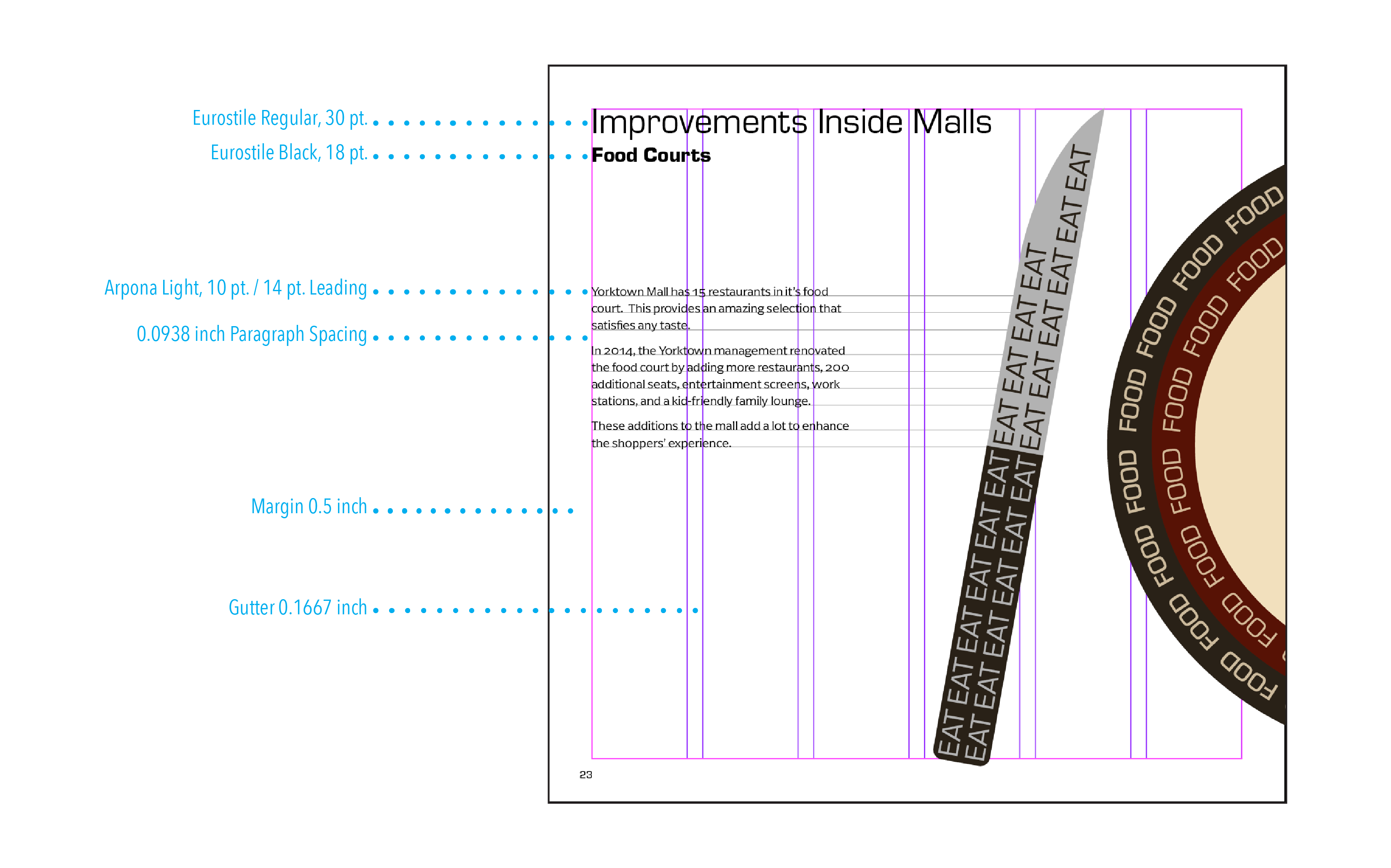
Eurostile is a typeface that has a modern, geometric, and sans-serif design. An eye-catching feature of Eurostile is the squared shapes with subtle rounded elements, and uniform character width.
Usage
Eurostile is practical in industries including: corporate branding, product packaging, posters, and architecture.
Why it’s been chosen
Eurostile has an edgy and technical look to it, that helps showcase the attribute of evolution and adaptation found throughout the years at malls. It simultaneously has a playful look as letters like “O” and “C” have a softness that portrays friendliness.


Form
Arpona is a typeface with small wedges in place of traditional serifs. It’s technically not a serif or sans serif, but is considered to be categorized as semi-serif.
Usage
Arpona is practical in industries including: packaging, advertising and editorial design as it’s very readable.
Why it’s been chosen
Since Arpona is a semi-serif, it works well with Eurostile as the contrast in style is visually appealing. Eurostile has a more modern touch and Arpona for a more classic or elegant feel. This helps bridge together the past and present, in regard to the adaptation and evolution of malls.
Typographic Hierarchy

Typographic Usage
Sketches
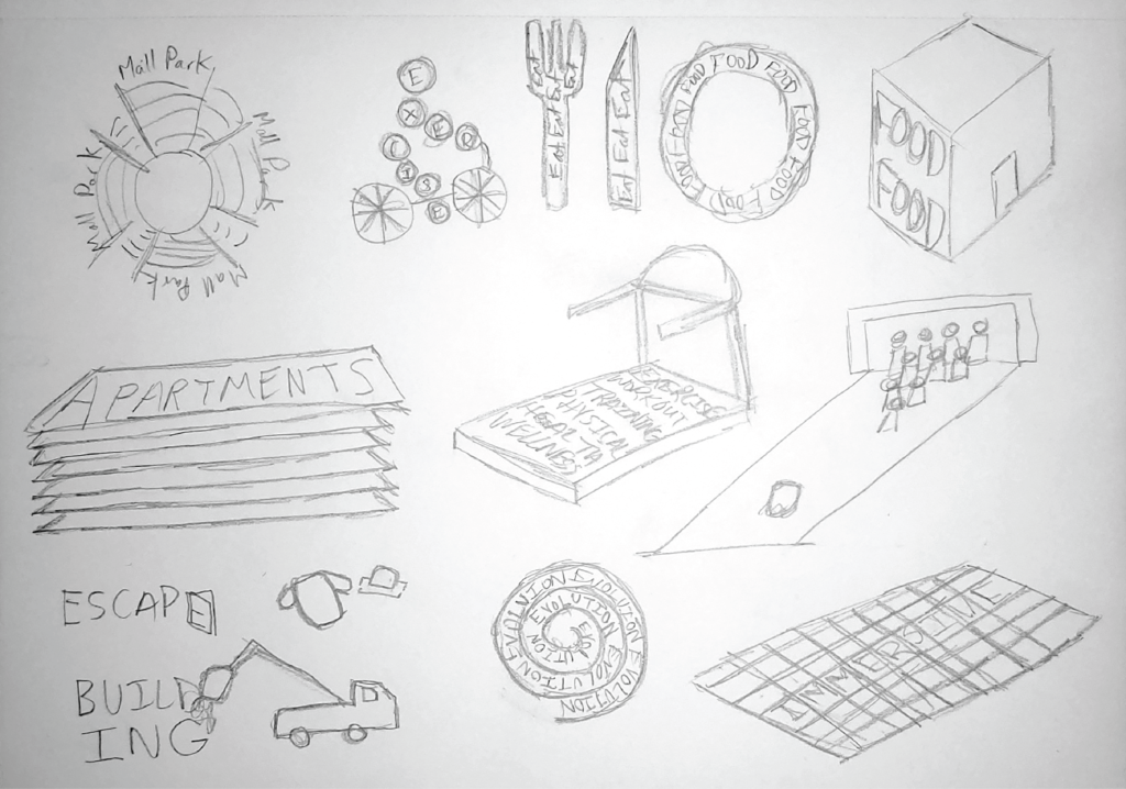
During the sketch phase, the end goal for all spreads was to portray the major theme of adaptation and evolution of malls by having all image through type creating a sense of motion, playfulness, and energy.
Media/Material Choices
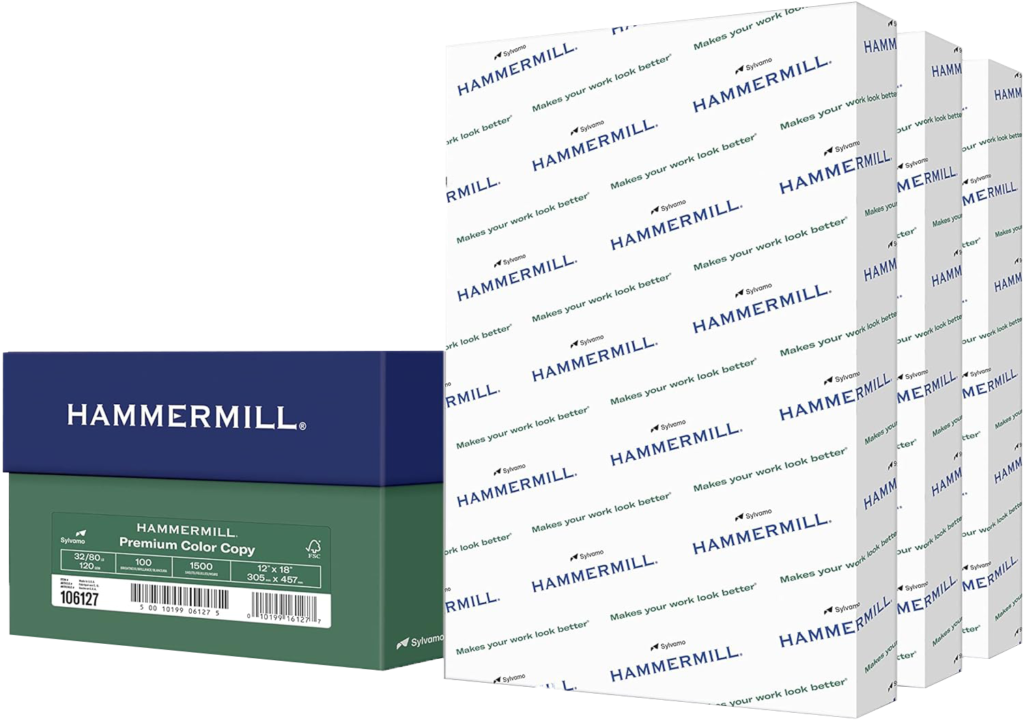
HAMMERMILL Premium Color Copy paper 32/80lb was chosen to print the book on. This was due to how it had a slightly glossy texture to it. The thickness of the paper was also appropriate for quality.
Saddle-stiching was the chosen way to produce the book, as the page length was appropriate, unlike perfect-binding.
Production
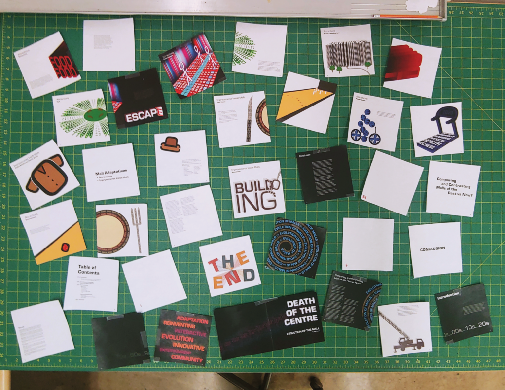
The first step taken to create a saddle-stich book was by printing a mini mockup of all the pages. Each spread was cut apart to reorganize all the pages to put in the correct order for a proper saddle-stich print.
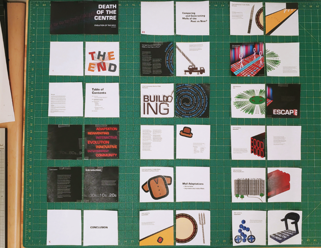
This is after reorganizing all the pages for the saddle-stich.
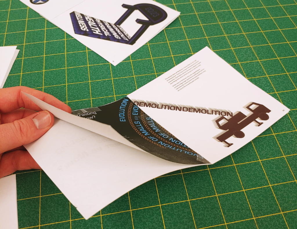
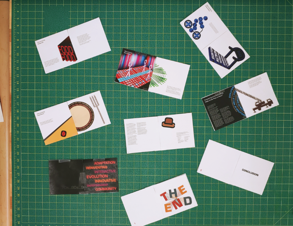
I then taped all the pages together and placed 2 spreads on the back of each other to properly line up which spreads would print on both sides of paper. The bottom right showcases the aftermath of the spreads being taped together.
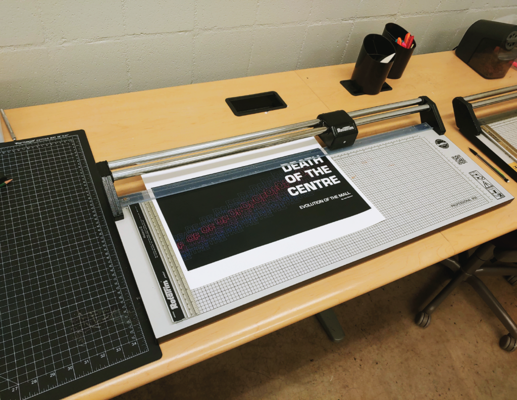
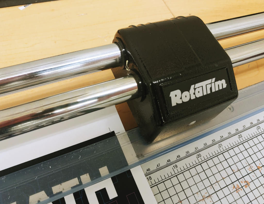
After using the mockup to reorganize the pages on the computer, the book was printed and then everything had to be trimmed.
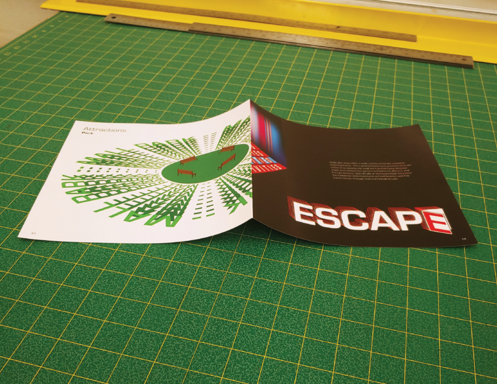
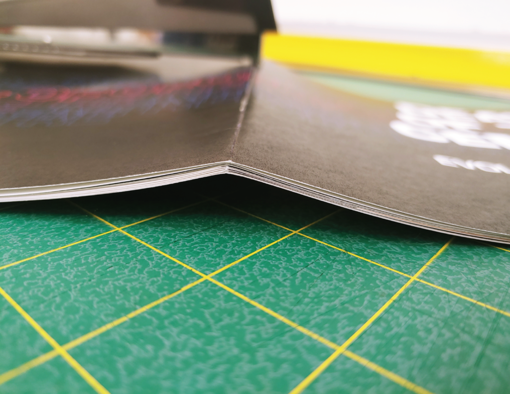
After trimming everything, all of the printed spreads had to be scored to make the saddle-stitch accurate.
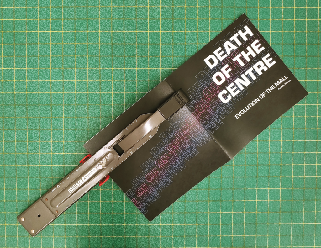
Last thing was to staple everything together on the spine.
Outcome
